PROJECT 1 - Tiny Organics Shipping Box
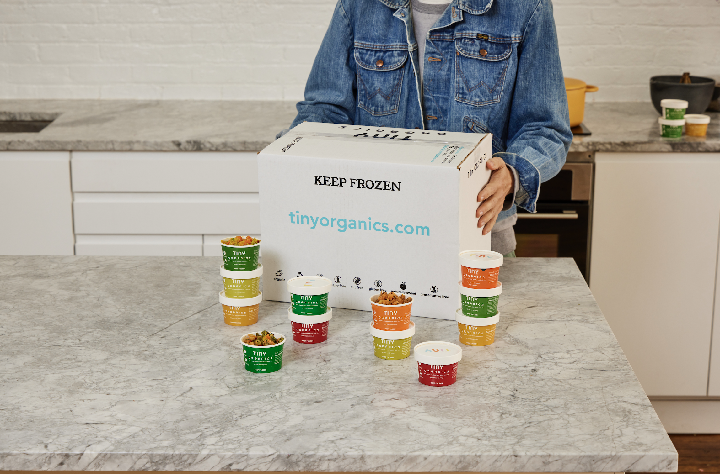
Being the first product a customers see, this shipping box includes a short introduction about Tiny Organics to immediately know the brand. With limited colors on a white kraft box, I used the signature blue Tiny has to create call outs and relay information. The copy on the box allows the playful nature of Tiny Organinics to shine through. The icons are the same I created to use on the website and other print collateral.

PROJECT 2 - Tiny Organics Cups
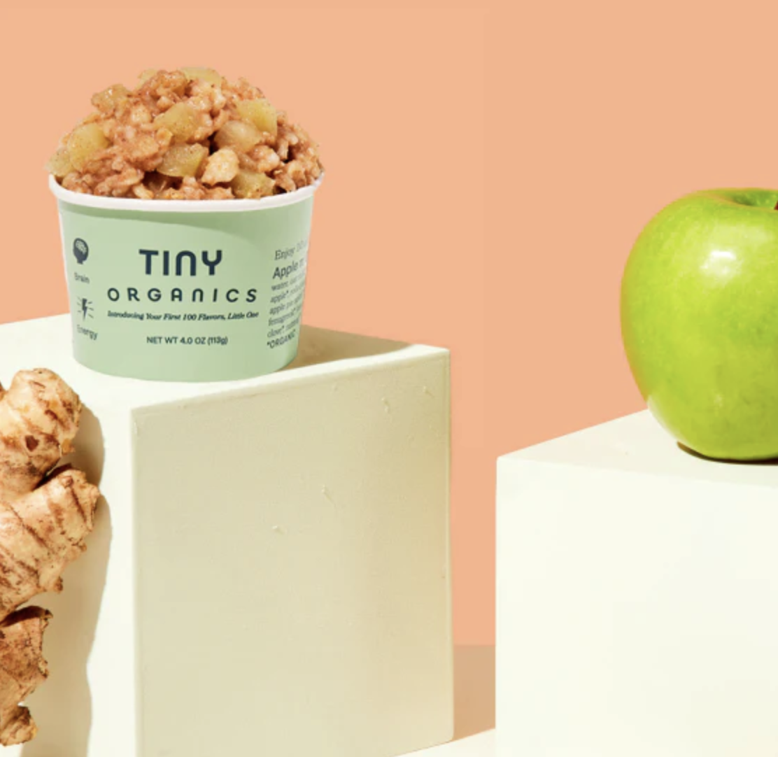
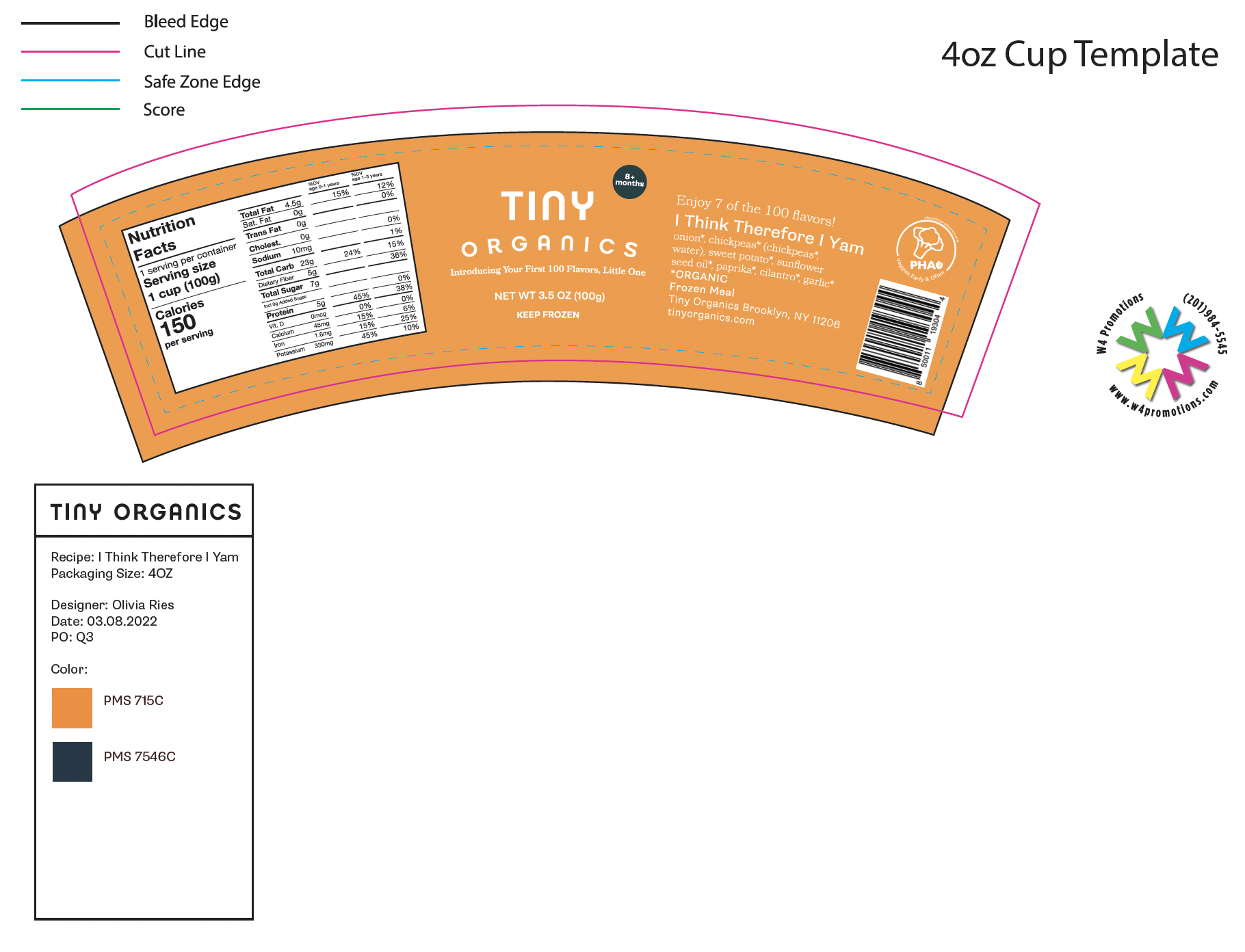
These 4 OZ Tiny Organics cups were a challenge because of how small they are and how much information was needed. Following the curvature of the cup, I included a full nutrition panel along with barcodes and full ingredient list. There is space for the PHA logo when included over the barcode. When choosing the colors for each cup, I kept in mind the ingredients, season, and appearance of the recipe. Along with how the colors line up with all other cups. The text can range from a dark blue to off white in order to be legible on any hue.

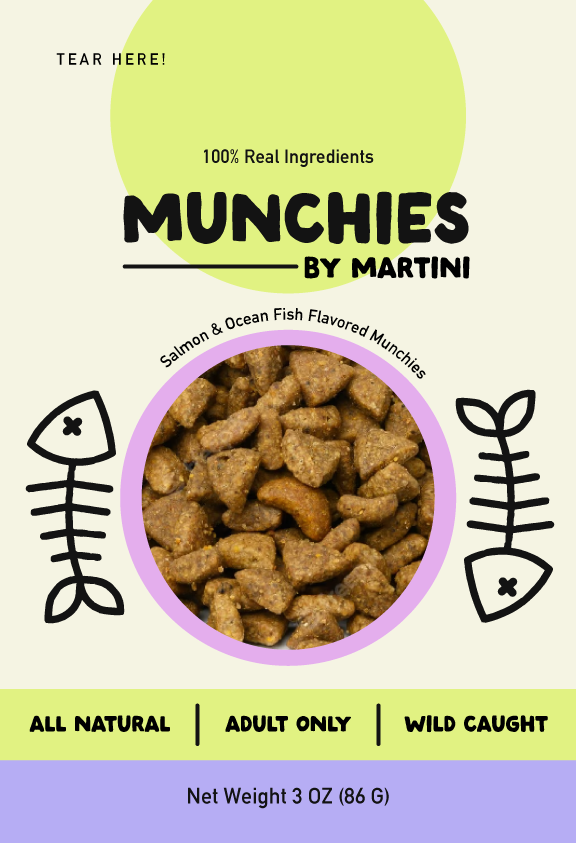
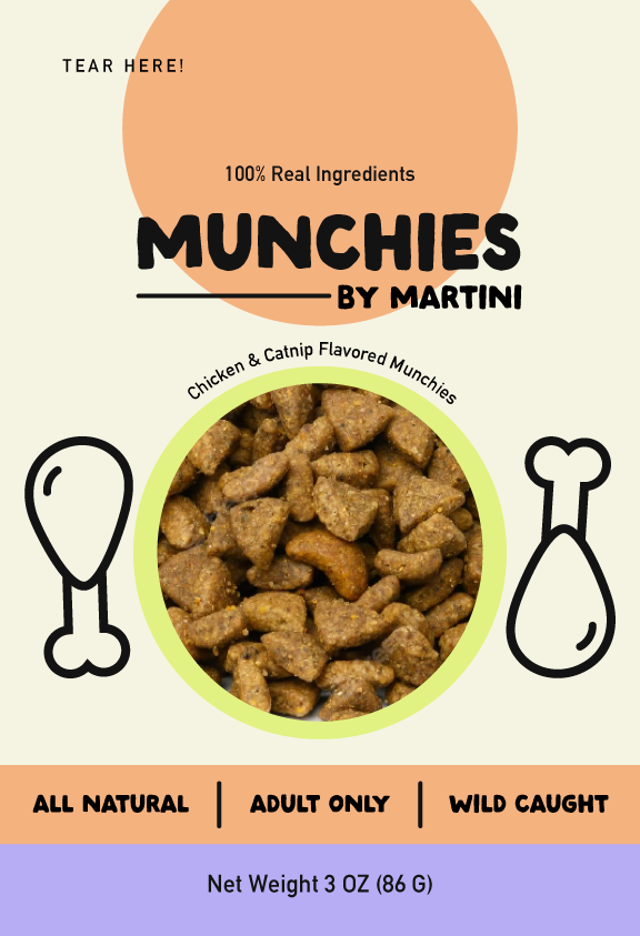
PROJECT 3 - Munchies by Martini
Inspired by my cat Martini’s love for treats, I designed this faux treat brand. Martini is a tuxedo cat but I used a bright colors and fun illustrations to represent his unique personality.
To keep my design making sharp, I love doing fun projects in my free time. This simple packaging design inspired me to create a whole brand that I can’t wait to share on my portfolio.

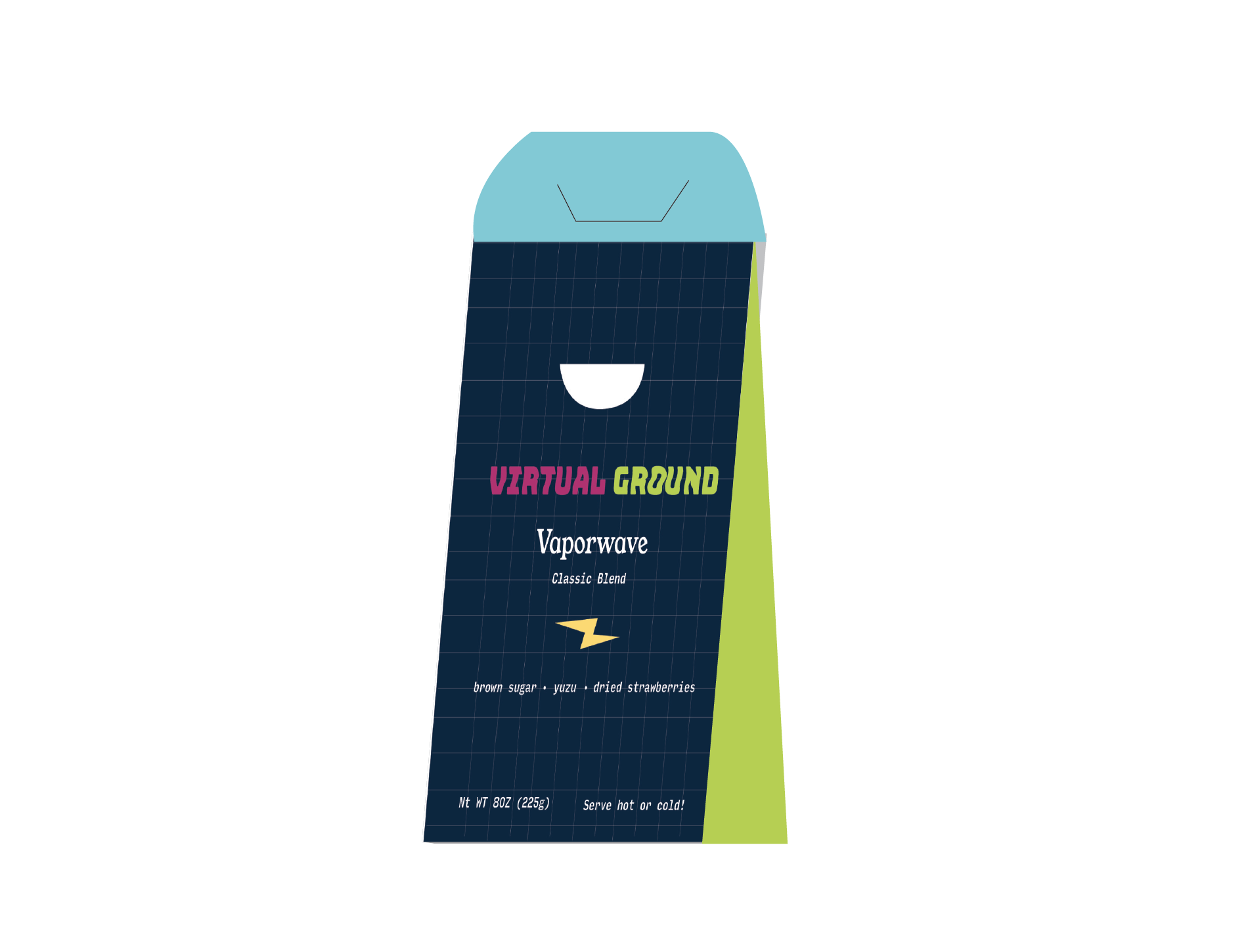
PROJECT 4 - Virtual Ground
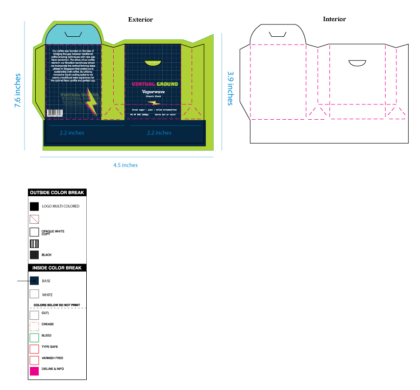
I was able to revisit the brand in and design two new packages following the same guidlines. This brand was always fun to work with because of the colors and variety of shapes/patterns I was able to use.
If you want to see the full brand check it out here! ︎︎︎
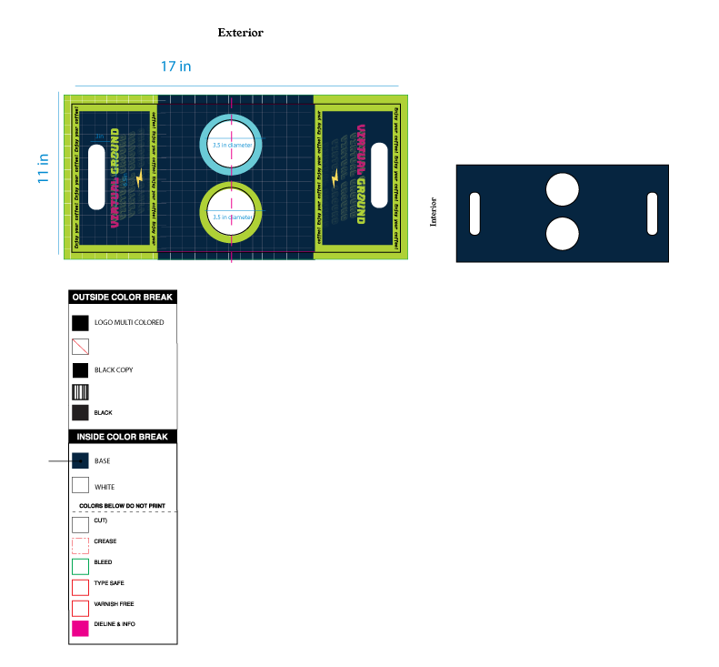
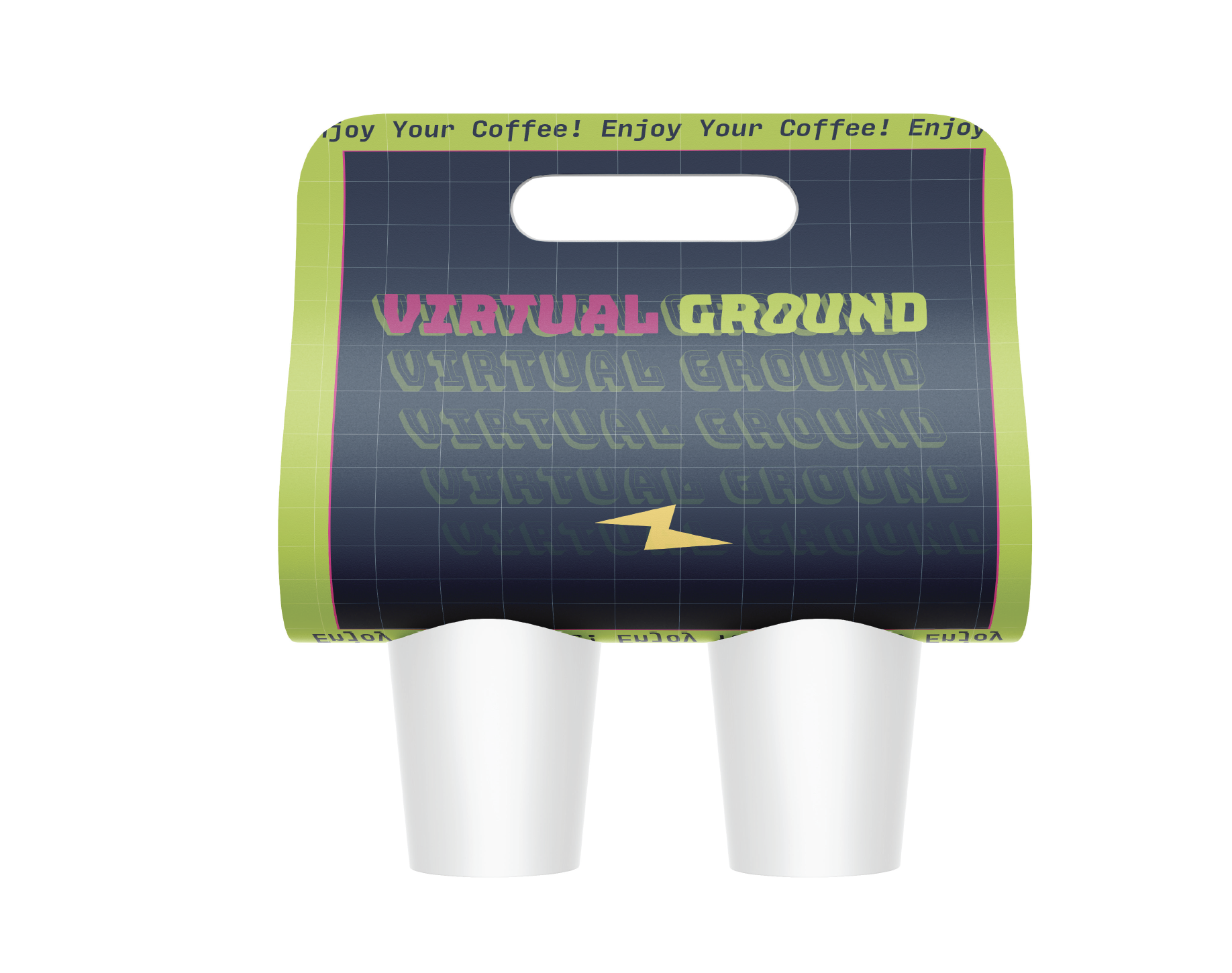
My second package is a coffee cup holder. This two cup carrier brings over the same colors and patterns from the coffee bag. With a lime green trim and the cascading logo, it encourages customers to enjoy their coffee.
