PROJECT 1 - PHA Veggies Early and Often Icon
In collaboration with Tiny Organics in 2020, I was tasked with creating an icon for PHA’s campaign, “Veggies Early and Often.” Through this campaign, PHA is outlining an agenda to raise a generation of veggies lovers. You can see the science behind their campaign here.
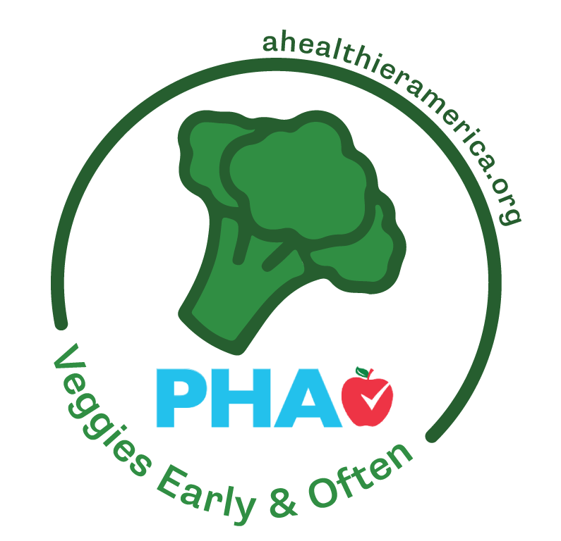
For the first rendition of the icon, PHA wanted a vegetable illustration to highlight the goal, the campaign slogan, consolidated logo, and url. I created this arch to give room for the slogan along the bottom and url on top while keeping the logo and broccoli within.
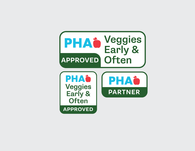
A year or so after the release of the first “Veggies Early and Often” icon, PHA reached out for a refresh, with several ideas and feedback. Since some companies who use the icon have limited space on their product, the first icon was hard to read, especially the url. I went through a few designs for the refresh, some incorporating the icon but no url, or vise versa.
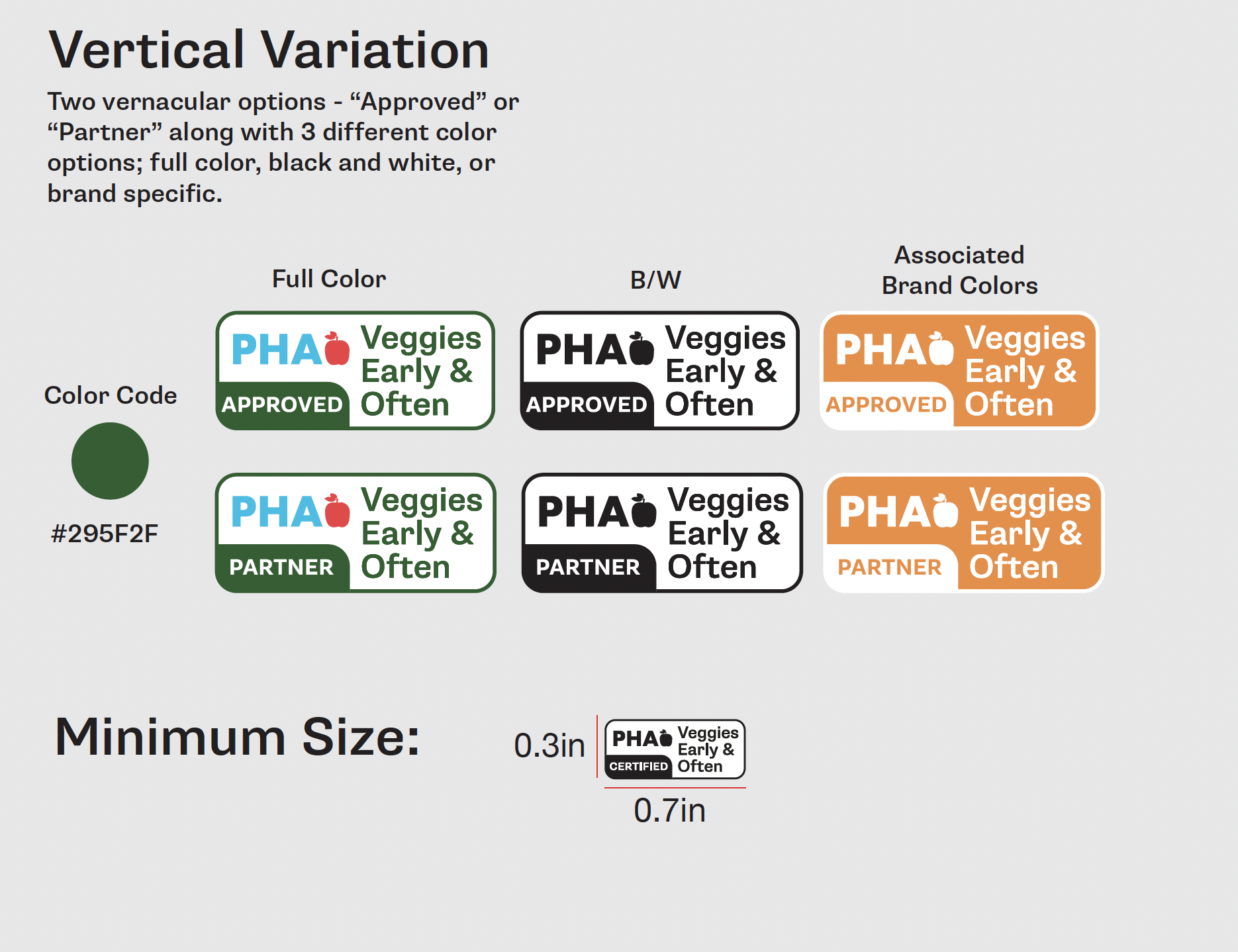
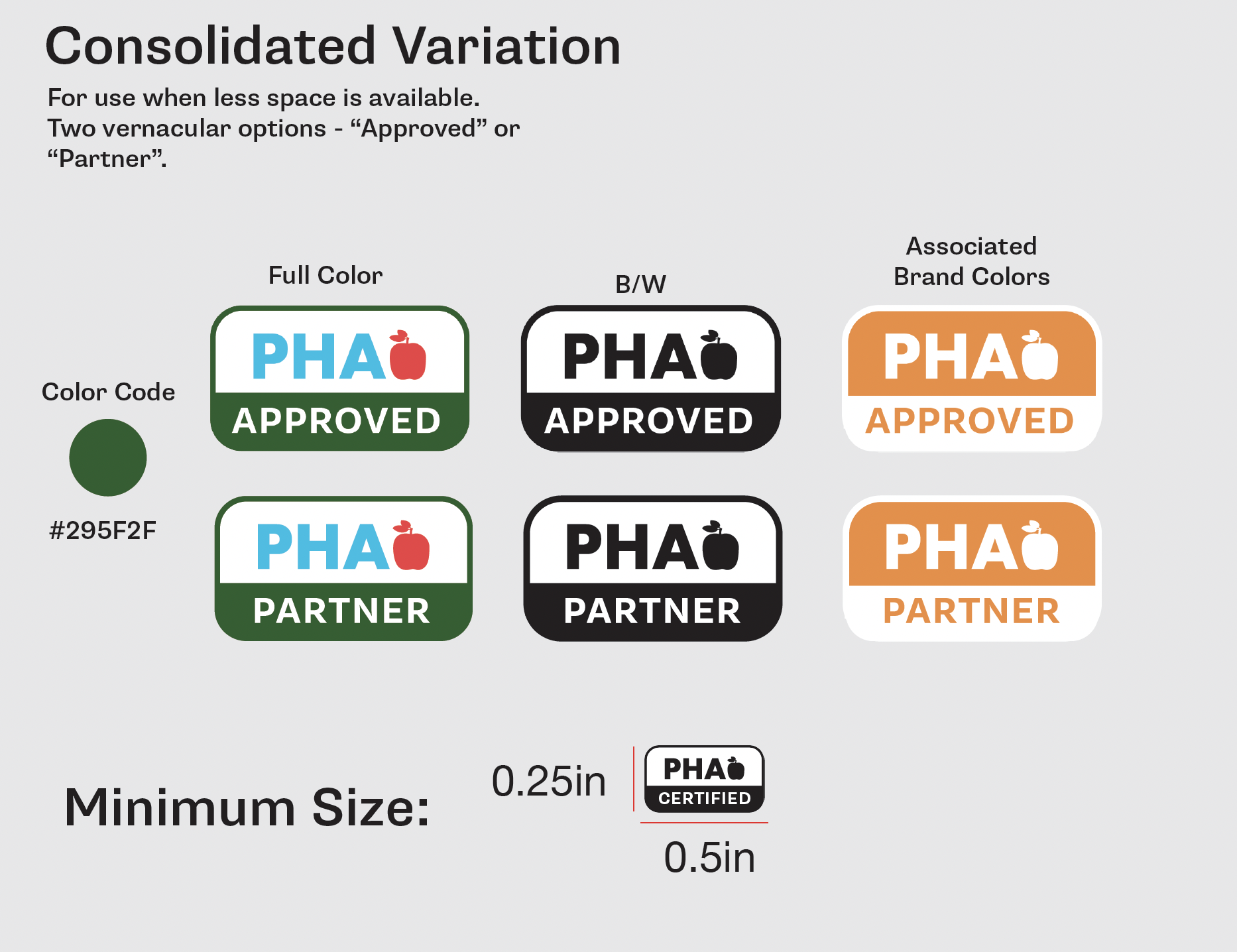
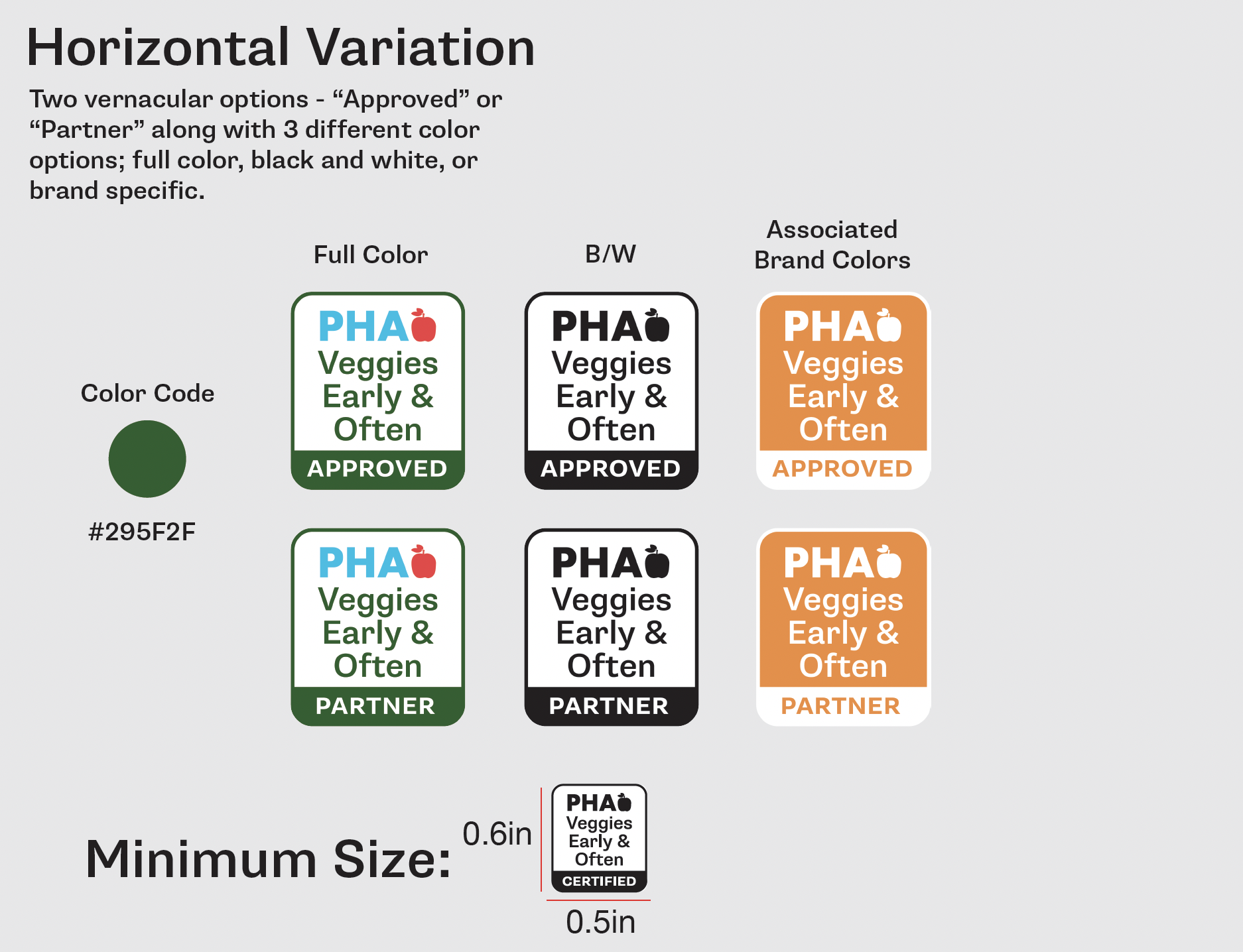
PHA originally wanted to keep the url and icon but these two elements were causing the legibility issues. So I removed both to achieve the needed size while keeping the slogan and logo and adding in the “APPROVED” or “PARTNER” as indicators for each icon. There’s 3 varying sizes for this icon, including a consolidated version that can be used in smaller designs. The guidelines include a minimum size for legibility of each icon. As well as 3 different color options.
PHA originally wanted to keep the url and icon but these two elements were causing the legibility issues. So I removed both to achieve the needed size while keeping the slogan and logo and adding in the “APPROVED” or “PARTNER” as indicators for each icon. There’s 3 varying sizes for this icon, including a consolidated version that can be used in smaller designs. The guidelines include a minimum size for legibility of each icon. As well as 3 different color options.
These Tiny Organics icon sets are multipurpose, being used across the website, on packaging, and printed materials. I created these to have a clean look and relay information exactly as they appear. My personal favorite is the delivery truck zooming away.
PROJECT 2 - Tiny Organics Icon Set
